


 I am no good at art, in fact I cannot draw to save my life. I do have a great appreciation of the discipline though. Although the concept of throwing a chair in pile with lots of other junk that has been labelled Fine Art has always perplexed me, I have always loved illustrations, photographs and prints. I also adore the meshing of words and images in books, magazines, brochures, posters and other forms of texts. Scouring degree shows is a very pleasurable experience and I am always astounded by the talent that the colleges in this country produces.
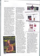
After revealing that savoury bit of information you may or may not be surprised to hear that I am an avid fan and collector of prospectuses from art colleges. England have a number of art institutions that are highly respected throughout the world such as the newly rebranded University of Creative Arts as well as the University of Arts which consists of Chelsea School of Art and Design, Camberwell School of Arts, London College of Communications, Wimbledon College of Art, London College of Fashion and Central Saint Martins School of Art and Design which is the creme a la creme. Their prospectus(s) certainly deserves a lot of credit. Each college has it's own prospectus and although they have different colours and content with a funky spin, the format is the sane all round. As you would expect from an institution of such visual presence, the prospectus expresses it's message through images. Lots and lots of images, some abstract, some not, some dark and some light and all sorts of sizes and shapes.
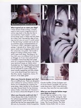
Moving out of the big smoke and into the Home Counties, the 2008/09 prospectus for the University College of the Creative Arts is very innovative, they have employed a double sided, upside down version with the campus side on one end and the course information at the other. I tell you it works very well too. We are greeted with lots of edgy photographs of the campus, students and their work. However it is the use of typography that really sells this product as well as the fantastic use of white space. All I can say is that they are a work of art.
Picture taken from Love Creative


3 cool comments:
Love that you've looked outside the box for creative inspiration - I'd love to get my hands on those! Did you read/buy Gisele Scanlan's The Goddess Guide? I always flick through it when I'm feeling like a little creative/girlie pick-me-up and visual stimulation that doesn't involve a 6ft-tall Amazonian supermodel or emaciated teen in Armani threads!
Erica/GirlWithaSatchel
Hello, I have just come across your fantastic blog! Reading this post I wonder if you may be interested in visiting my blog which is fairly new, I am an illustration student and post most of my work on here and I'm looking to study at one of these fantastic art schools next year. I would be delighted if you could leave me some feedback : )
Paris x
Hi. first of all let me say that i like your blog. Great stuff. Thanks for sharing.
Regards,
image coloring
Post a Comment